Covi-Trac: Designing a Transparent COVID-19 Fund Tracking System
In 5 days at Kenya's first COVID-19 Virtual Hackathon, a team of 3 (2 engineers + me as solo designer) built a real-time financial tracking dashboard. We placed 2nd. I led all UX research, IA, UI design, prototyping, and QA.
In 5 days during a virtual hackathon, my team built a real-time COVID-19 financial tracking dashboard for Kenya. We placed 2nd out of all competing teams. I led all UX research, information architecture, UI design, prototyping, and QA.
Context
Billions mobilised, near-zero public visibility
It's February 2021. Kenya had mobilised KES 9.95 billion in COVID-19 emergency response funds — but the public had almost no visibility into where that money was going, how much had been used, or which counties were most affected.
Transparency International Kenya and Fojo Media Institute launched Kenya's first COVID-19 Virtual Hackathon (9–13 February 2021, entirely remote over Zoom).
The goal:
Take the Kenya COVID-19 Aid Tracker and make it actually useful. Better visualisations. More accountability. More transparency.
Project Details
-
Role
Solo UX/UI Designer -
Team
Masters of JS (3 people) -
Tools
Adobe XD, Vue.js, Vuetify, Netlify -
Duration
5 Days -
Result
🥈 2nd Place
The Hackathon Brief
Two challenges, one underlying problem
Challenge I
How can we better visualise data on the COVID-19 Aid Tracker?
Challenge II
How can we crowdsource and present figures and stories on COVID-19 corruption cases?
The World Bank estimated the global economy stood to lose close to $8 trillion from COVID-19. In Kenya specifically, KES 9.95 billion had been directed toward emergency response. 37.6% had been received. Only 22.8% had been deployed. The rest? Unclear.
Both challenges were about the same underlying problem: public funds were being mobilised at scale, but the data was messy, unstructured, and inaccessible to the average person, let alone a government official trying to make decisions in real time.
Day 1: Research
Three types of users, one urgent need
We kicked off day one with a remote working session over Zoom. As the designer, I led a quick scoping and discovery conversation with the team to align on what we were building, who we were building it for, and what "done" looked like in 5 days. The target users were:
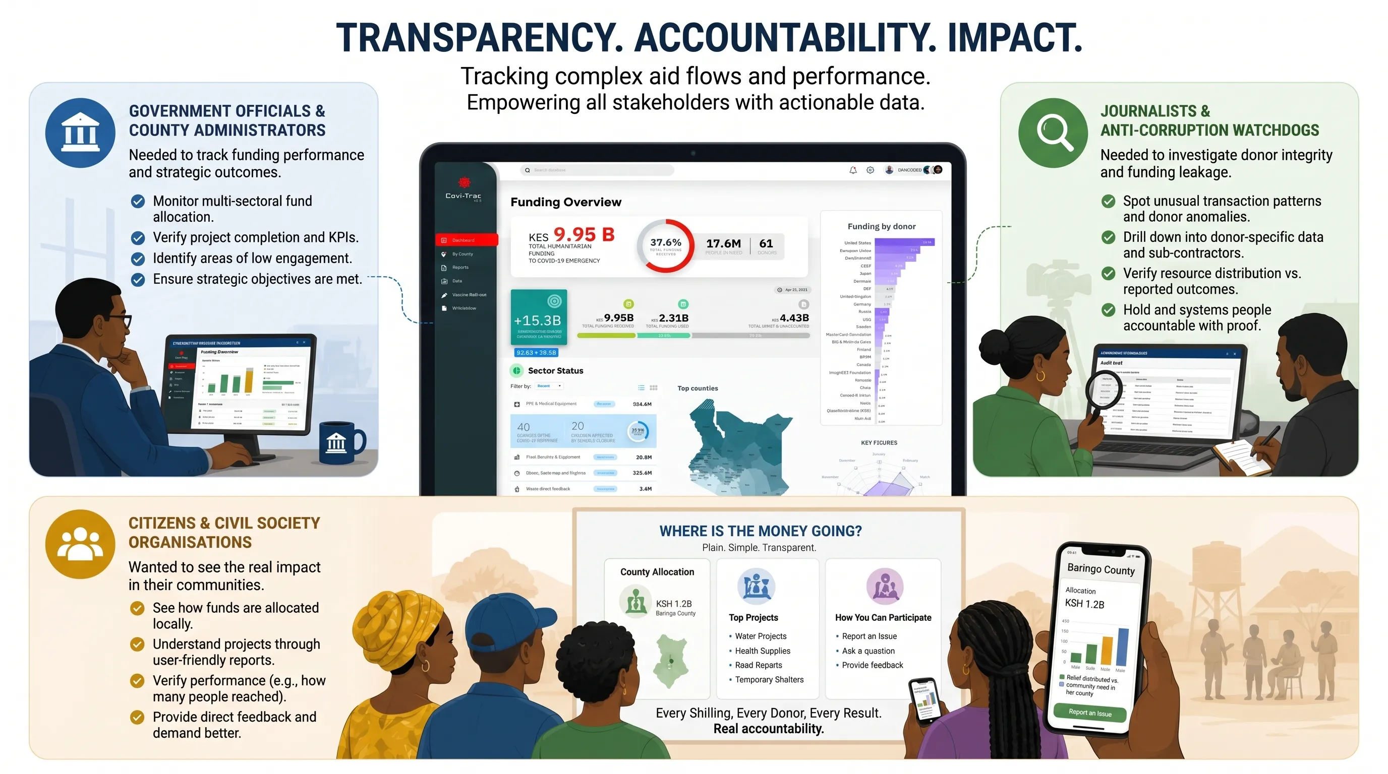
Each user type had different data literacy and different urgency. The design had to serve all three without overwhelming any of them.
Day 2: Design
Designing for Data
The core tensions I identified early:
- The raw data was unstructured and inconsistent across sources
- A lot of support was given "in kind" (food, clothes, equipment) which couldn't easily be represented in graphs
- Political interference made some data politically sensitive, requiring careful framing
- There was real time pressure: 5 days start to finish, including development
Design
Information Architecture

After initial research and a team alignment session, I designed the information architecture for the web app. The goal was to keep navigation shallow and intuitive so that users could get to what they needed fast.
The app was structured across 7 top-level sections:
- Dashboard the central command view: funding overview, sector status, top counties, donor breakdown, and key figures all visible at a glance.
- By County a geographic breakdown of cases, funding, and response by Kenyan county.
- Reports the COVID-19 Situation Report, aggregating government response news and policy updates.
- Data cumulative case data, contact tracing stats, and county-level visualisations.
- Vaccine Roll-out vaccine distribution tracking by manufacturer, population coverage, and dosage progress.
- Whisleblow a crowdsourced corruption reporting feature, allowing users to flag and submit corruption cases tied to COVID-19 funds.
- Settings / Profile user management.
Design Process
Rapid Wireframing and Prototyping
Given the 5-day constraint, I went straight to mid-fidelity wireframes. There was no time for extensive iteration, the process had to be lean. I used Adobe XD throughout, which made handoff to the engineers significantly smoother.
Once the wireframes were reviewed and agreed upon during a Zoom session with the team, I moved directly into high-fidelity design. The engineers began setting up the tech stack in parallel, so by the time my first screens were ready, they were ready to start building.
Key Screens & features
The dashboard
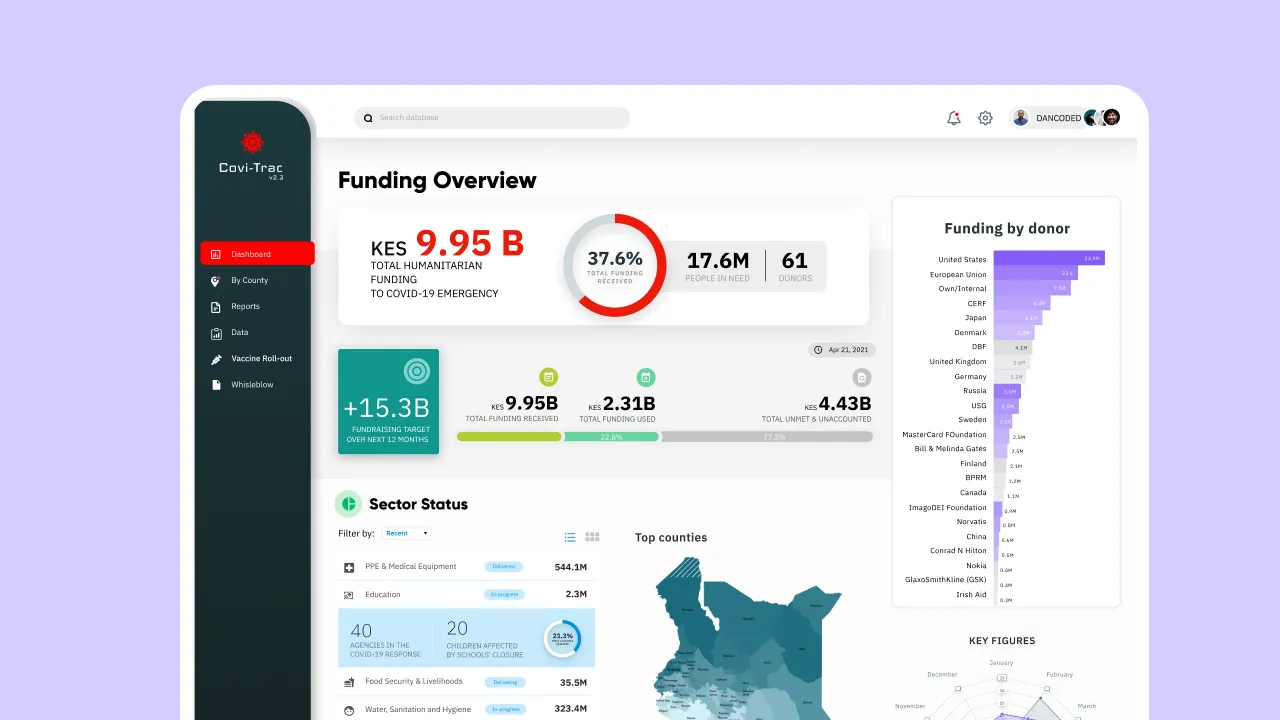
The dashboard was built around one principle: everything that matters, on one screen.
A senior government official or journalist opening the app should be able to answer the key questions within seconds:
- How much money has been raised?
- How much has actually been received?
- Where is it going?
- Which counties are most affected?
The funding overview card showed the total humanitarian funding, with percentage received, number of people in need, and active donors, all visible without scrolling. A "Funding by Donor" breakdown on the right showed contributions from the United States, European Union, Japan, Germany, Sweden, the Bill and Melinda Gates Foundation, and more.
The Sector Status section broke down expenditure by category (PPE and Medical Equipment, Education, Food Security and Livelihoods, Water Sanitation and Hygiene, Health) with delivery status and KES amounts.
A choropleth map showed Top Counties by funding or cases.
Reports
The Reports section served a dual purpose: situational awareness and accountability. It pulled in COVID-19 news and government response updates, tagged by category (corruption, ujinga, directives), so users could filter by type.
Reports could be toggled between a Simple view (narrative, isotype charts, key stats in plain language) and a Complex view (detailed bar charts, date-range filtering, full breakdown). This was one of the features I was most proud of, meeting users where they are, whether they're a data-literate analyst or a first-time visitor.
Vaccine Roll-out
The Vaccine Roll-out section tracked Kenya's vaccination progress across five manufacturers: Oxford/AstraZeneca, Pfizer-BioNTech, Sputnik V, Moderna, and COVAX.
Each vaccine card showed doses given vs doses remaining, and a percentage progress bar.
A Vaccination Report donut chart on the right showeddoses given per 100 people, broken down into "at least one dose" and "fully vaccinated". Population Overview showed demographic breakdowns (men,children, women, total) and a Vaccination Priority chart showing the focus on the older generation.
Key Design Decisions
Making data feel human
- County-level breakdown first — Kenya has 47 counties with wildly different COVID impact levels. Leading with a county map immediately grounds abstract national figures in places people recognise.
- Progressive disclosure — High-level summary cards at the top (total received, total deployed, gap) with drill-down capability for deeper analysis. Citizens see the headline; officials can dig in.
- Corruption submission flow — A lightweight crowdsourcing module allowing journalists and citizens to submit evidence of fund misuse, with a clear moderation pipeline.
- Colour language — Green (deployed), amber (received but undeployed), red (gap/missing) — consistent across all charts so users build pattern recognition quickly.
The Result
We placed 2nd out of all competing teams
The judges' feedback pointed to our strongest areas: the depth of the funding and expenditure visualisations, the clarity of the dashboard, and the reporting interface. Where we fell short of 1st place was in-kind support, the winning team managed to illustrate non-monetary donations (physical goods, equipment) with dedicated visuals and clear categorisation, which we had scoped out due to time constraints.
The winning submission covered: In-kind support with illustrations of the types of support and donating bodies
A lesson learned: scope is everything in a hackathon, and the teams that think about edge cases early win on completeness.
Retrospective
What I learned from 5-day sprints
Constraints sharpen decisions. With 5 days total, there was no room for "we'll figure it out later." Every UI decision had to be justified instantly. I made more confident design calls in this project than in much longer ones.
Data visualisation is UX. Chart type selection, colour choices, and label placement are as important as navigation and button states. The line between information design and UX design dissolves when the product is a dashboard.
Cross-disciplinary trust is fast when goals are shared. The two engineers and I had never worked together before. But with a clear shared goal, we had design-to-dev handoff working within 24 hours.
Impact and Significance
The Kenya COVID-19 Aid Tracker problem was real. At the time, only a fraction of the mobilised funds had been accounted for publicly. Tools like Covi-Trac existed to close that gap, to make it harder for funds to disappear without a trace.
The hackathon itself was the first of its kind in Kenya, and the Covi-Trac project was one of the few submissions that addressed both visualisation and accountability in a single, cohesive product.
This project sits at the intersection of civic technology, data design, and public health, three areas where design can make a genuinely meaningful difference.