Redesigning Equity Mobile for a Super App Future
From a legacy banking tool to a scalable platform foundation, serving 8M+ users across East Africa.
Disclaimer: Some details in this case study have been kept vague to protect client IP under NDA. Some design elements have been altered from the original.
Overview
A super app for East Africa
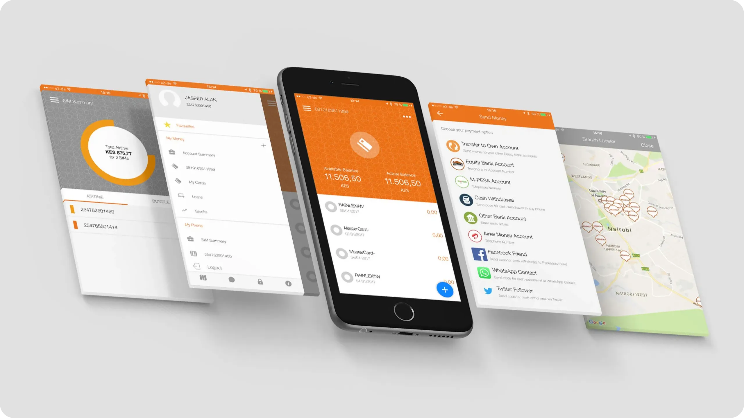
Equity Bank is one of Africa's largest financial institutions, 15 million customers, 7 countries, decades of trust. But their mobile app, Eazzy, was starting to work against them.
The Goal
Redesign Eazzy into a lifestyle super app that could compete with M-Pesa, WhatsApp Pay, and a growing wave of fintech challengers across East Africa. Think mini-apps, lifestyle services, third-party integrations, the whole vision.
What shipped was different. And the story of why is just as important as the design itself.
I was the sole senior designer for the first 14 months, owning discovery, information architecture, stakeholder alignment, and core UX, before expanding into a team of three. This case study covers the full arc: the ambition, the decisions, the constraints, and what actually launched.
Project Details
-
Role
Lead Product Designer -
Duration
18 months (2022–2023) -
Platform
iOS & Android -
Reach:
8M+ users, 7 markets
The Problem
The old app was becoming a liability
The Eazzy app worked, in the way that a car with a slow engine, broken locks, and an unreliable GPS technically works. It moved money. It checked balances. But the cracks were visible, and users were paying for them.
- Security and fraud vulnerabilities Eazzy was periodically tied to high-profile fraud cases, most notably syndicate fraudsters exploiting unencrypted public Wi-Fi connections or manipulating app features to access user accounts. For a bank whose entire value proposition is trust, this was critical.
- A dated, unintuitive interface Navigation that made sense five years ago didn't hold up next to newer competitors. Simple tasks took too many steps. Users expected better.
- Unreliable performance Intermittent outages, especially on weekends. Slow load times, unexpected crashes on launch. The kind of friction that erodes confidence quietly, over time.
- Login and registration failures Customers routinely couldn't complete basic account setup, locked out before they could even start.
- OTP delays One-Time Passwords arriving minutes after they had expired. Real-world consequence: transactions failing at checkout counters, in public, in front of people. That's not a UX inconvenience. That's embarrassment and lost trust.
At the same time, Equity was expanding across markets and needed an architecture that could scale with them. The old app wasn't built for what the business was becoming.
The goal wasn't just to fix these issues. It was to build a foundation that could grow into something bigger, a platform, not just a banking utility.
Discovery
Starting with honest questions, not assumptions
Before opening Figma, I spent three weeks in discovery, not to validate a direction, but to genuinely understand what we were dealing with.
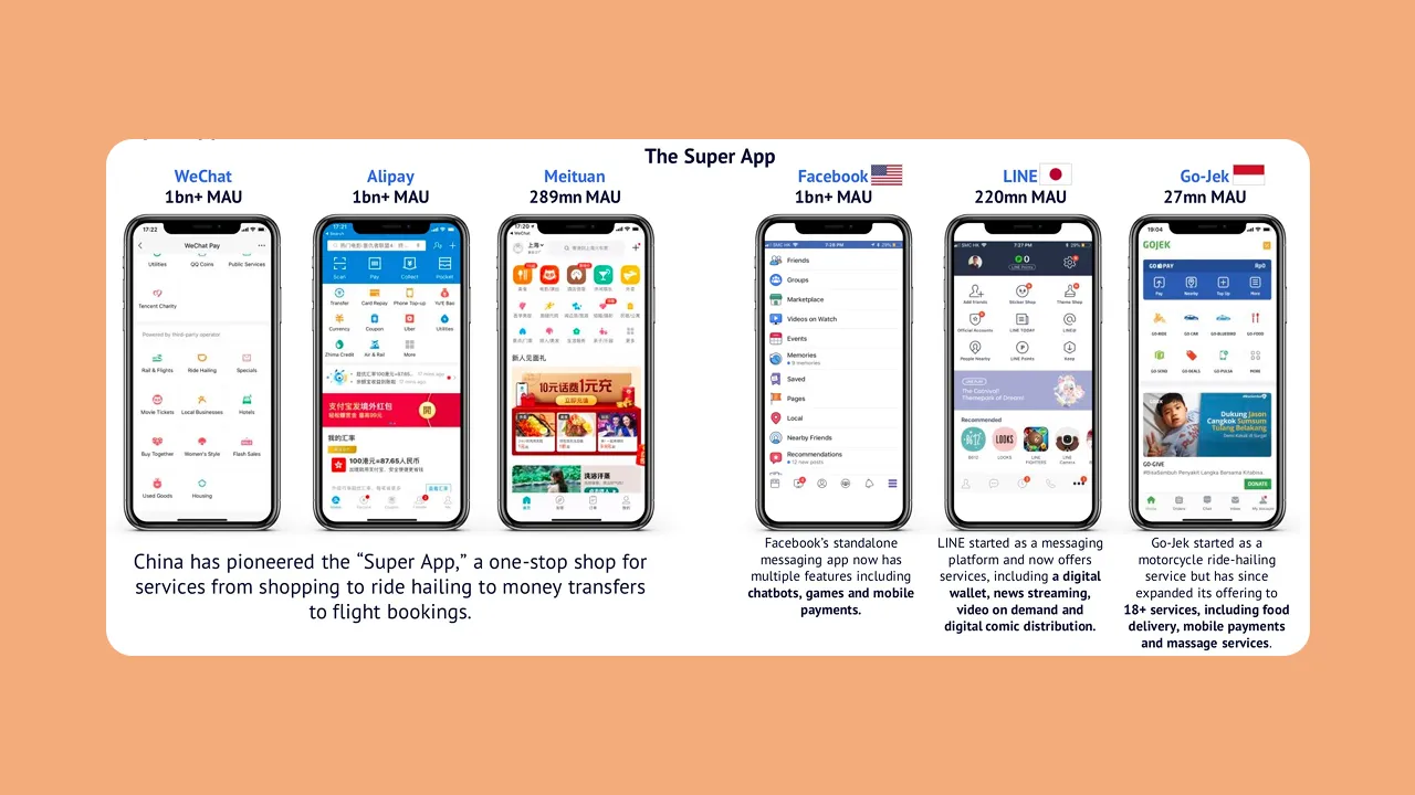
I reviewed hundreds of App Store and Play Store reviews, focusing on recurring language patterns rather than individual complaints. I tore down 8 super apps across Asia and Africa, WeChat, Grab, M-Pesa, Airtel Money, among others, mapping their navigation models, onboarding patterns, and how they handled the tension between depth and simplicity.
I also ran two working sessions with the product and business teams to understand the internal picture: where business units disagreed, where assumptions were untested, and where the biggest risks were.
One tension surfaced immediately and never fully went away: the bank wanted a platform. Users wanted speed.
These aren't incompatible goals, but they pull design in different directions. A platform optimised for breadth can easily sacrifice the fluency that makes a banking app feel trustworthy. Getting that balance right became the central design question for everything that followed.
Research
What users actually told us, including the uncomfortable parts
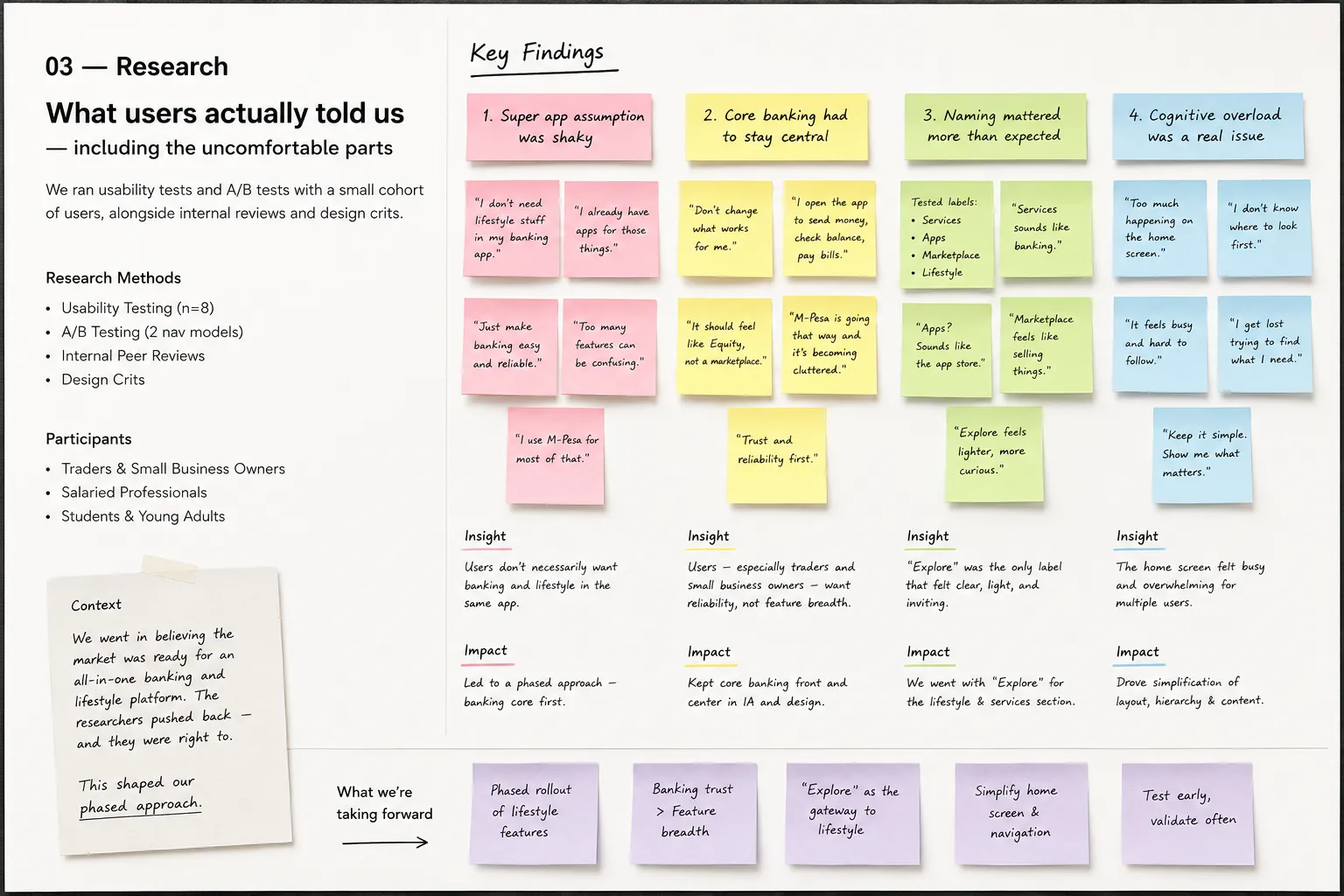
Research was a collaborative effort. I worked closely with the research team throughout, sitting in on usability sessions, reviewing findings together, and translating insights into design decisions. I didn't just receive research outputs; I was in the room as they happened, watching users think out loud.
We ran usability tests and A/B tests with a small cohort to determine which navigation and flow models resonated. We also ran internal peer reviews and design crits, which helped surface usability flags early before they reached users.
Some of what we found confirmed our direction. Some of it challenged it directly.
- The super app assumption was shaky We went in believing the market was ready for an all-in-one banking and lifestyle platform. The researchers pushed back, and they were right to. Our demographic wasn't necessarily looking for digital banking and lifestyle features in the same app. That feedback created real tension internally, and it ultimately shaped our phased approach.
- Core banking had to stay central Users, particularly traders and small business owners, were clear: they didn't want lifestyle features crowding out the banking functionality they relied on daily. One pattern that emerged repeatedly was users mentally comparing us to M-Pesa, which was at that time beginning to add lifestyle-adjacent services. The comparison wasn't flattering in every direction. It reinforced that trust and reliability had to come before feature breadth.
- Naming mattered more than expected We tested several labels for the lifestyle and services section, "Services," "Apps," "Marketplace," "Lifestyle." None landed cleanly. Users responded to "Explore." It was lighter, less transactional, more curious. We went with it.
- Cognitive overload was a real issue Multiple users described the home screen as busy and hard to follow. That note travelled with me through every subsequent design decision.
Information Architecture
What a super app navigation actually requires at scale
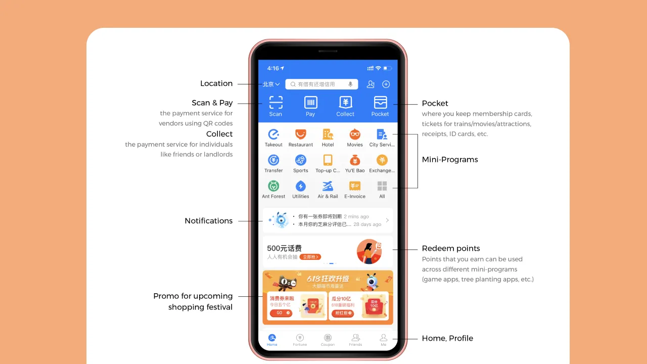
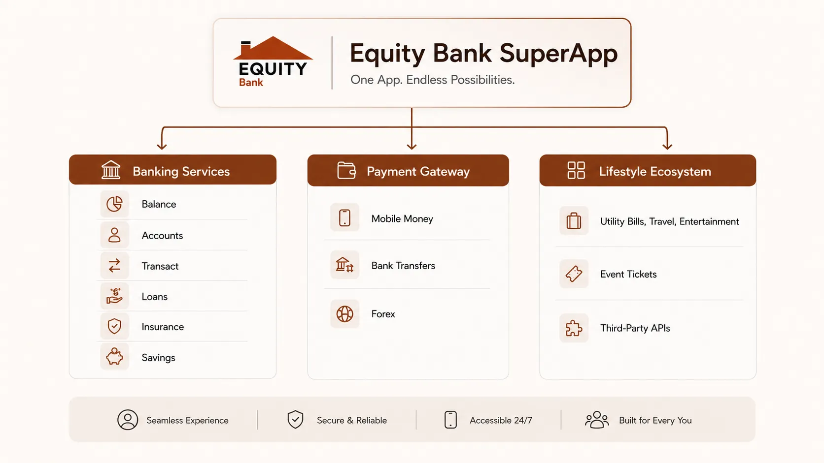
The IA challenge in a super app isn't adding features. It's preventing the experience from collapsing under the weight of them.
I mapped three structural approaches for how banking features and lifestyle mini-apps could coexist without cognitive overload:
- Option A Tab-based model with a dedicated marketplace section
- Option B Persistent bottom nav with a contextual mini-app launcher
- Option C Unified activity feed with surfaced shortcuts
All three were tested with users in unmoderated sessions. Option B won, clearly. Task completion was highest, and users could orient themselves faster when core banking and lifestyle features occupied distinct but connected spaces.
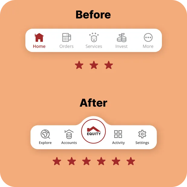
The bottom nav ultimately carried three core items, down from five in the original app. That reduction wasn't about simplicity for its own sake. It was about reducing the decision load on users who opened the app to do one specific thing, and didn't want to navigate around everything else to do it.
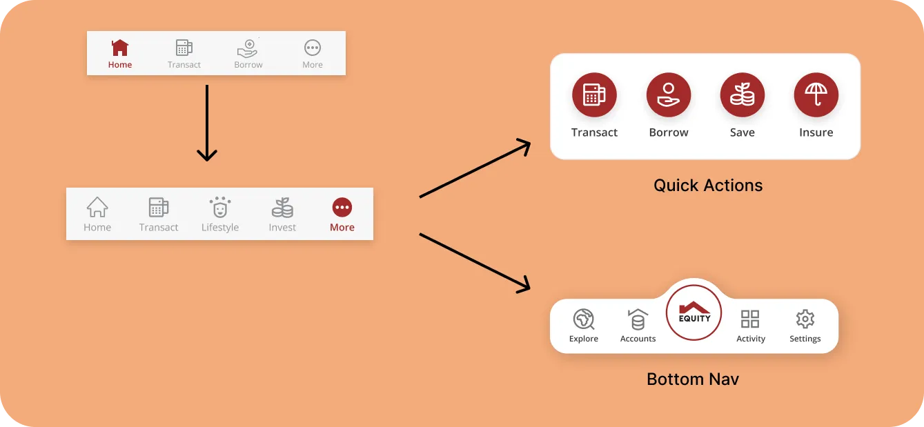
The hardest IA problem in a super app isn't adding features. It's preventing cognitive overload as the feature set grows.
I mapped out three structural approaches for how banking features and third-party mini-apps could coexist at scale. The options ranged from a tab-based model with a dedicated marketplace section, to a unified feed, to a persistent bottom nav with a contextual mini-app launcher.
I ran unmoderated usability tests across all three. The bottom nav with a contextual launcher, Option B, won clearly. Task completion was highest, and users were able to orient themselves faster when core banking actions and mini-apps occupied distinct but connected spaces.
That insight became the foundation for three stakeholder sessions where I walked leadership through the IA proposals, design direction, and a phased rollout strategy. I wasn't just presenting options. I was building the case for a specific direction, with user data behind it, and iterating until I had genuine buy-in rather than polite agreement.
Getting real stakeholder alignment, not just sign-off, is part of the design work. It shapes what actually gets built.
Getting genuine buy-in, not just sign-off
This IA work formed the backbone of three stakeholder sessions with leadership. I wasn't presenting options and waiting for approval. I was walking them through a specific recommendation, with user data behind it, and iterating until I had genuine alignment, the kind where people understand the reasoning, not just the direction.
This matters because stakeholder buy-in at the IA stage is what protects design decisions downstream. When scope pressure arrived later (and it did), having documented decision criteria made it easier to hold the line.
Design System Contributions
Building on the foundation, extending it where it broke
The core design system was established at the start of the project. My role wasn't to build it from scratch, it was to extend it as new product areas created requirements it wasn't designed to handle.
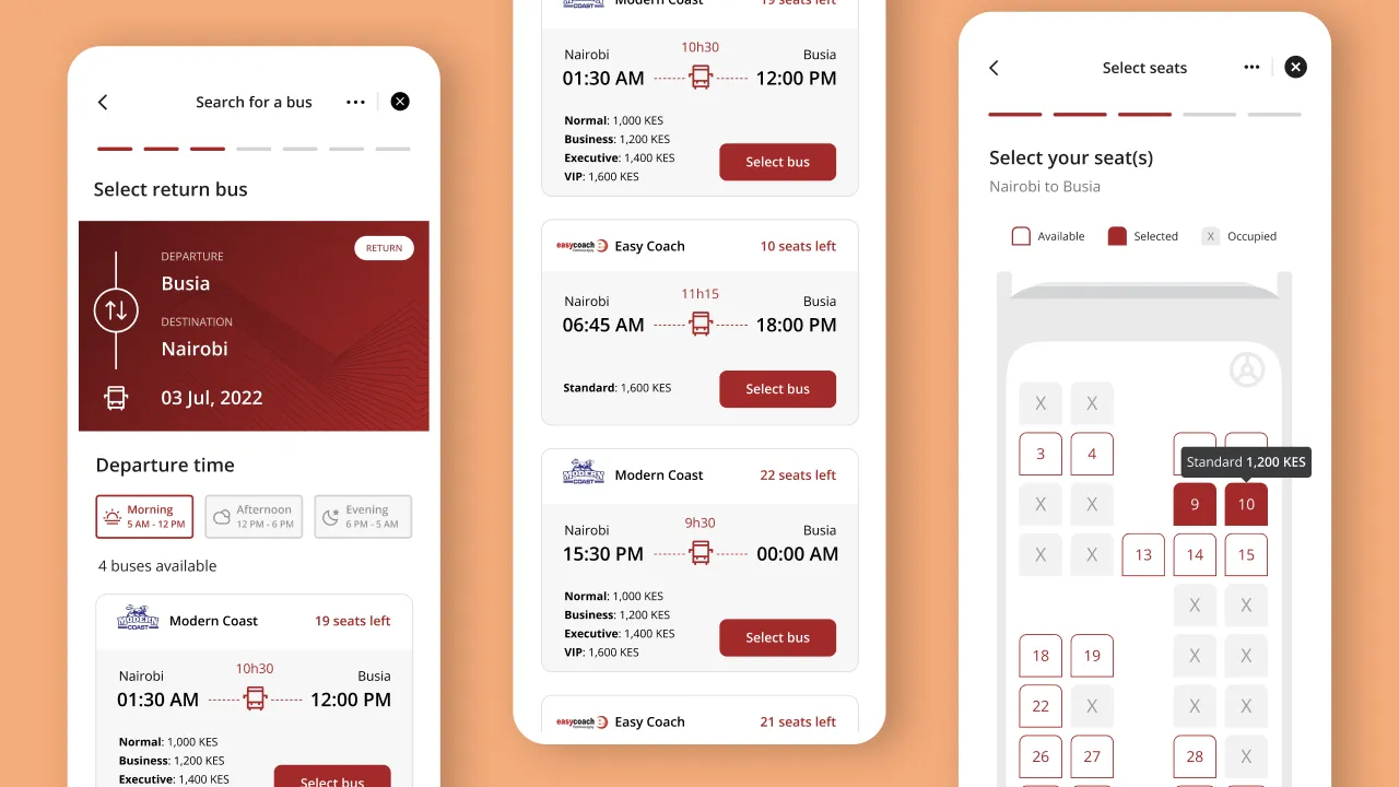
Mini-apps introduced use cases the existing component library didn't cover. Bus hailing, ride booking, food ordering, and flight booking all required new progress states, loading patterns, and transactional feedback that core banking flows didn't need.
I designed and built:
- Progress components for multi-step travel and booking flows
- Countdown components for time-sensitive transactions
- Travel receipt layouts and partner asset treatments
Some mini-app integrations, like Little, came with their own SDK, meaning we were embedding a third-party experience inside our app. Design token customisation was possible up to a point, but some elements couldn't be made to fully match our system. That was a trade-off we documented and accepted, rather than letting it become a bloat decision.
Visual Design
Where IA meets the screen, and the decisions in between
The IA gave us a structure. Visual design had to make it work for people who wouldn't read a navigation diagram, they'd just open the app and start tapping.
The core tension in the visual design phase was the same one that ran through the whole project: banking and lifestyle needed to coexist without either feeling bolted on to the other.
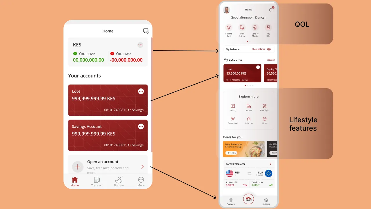
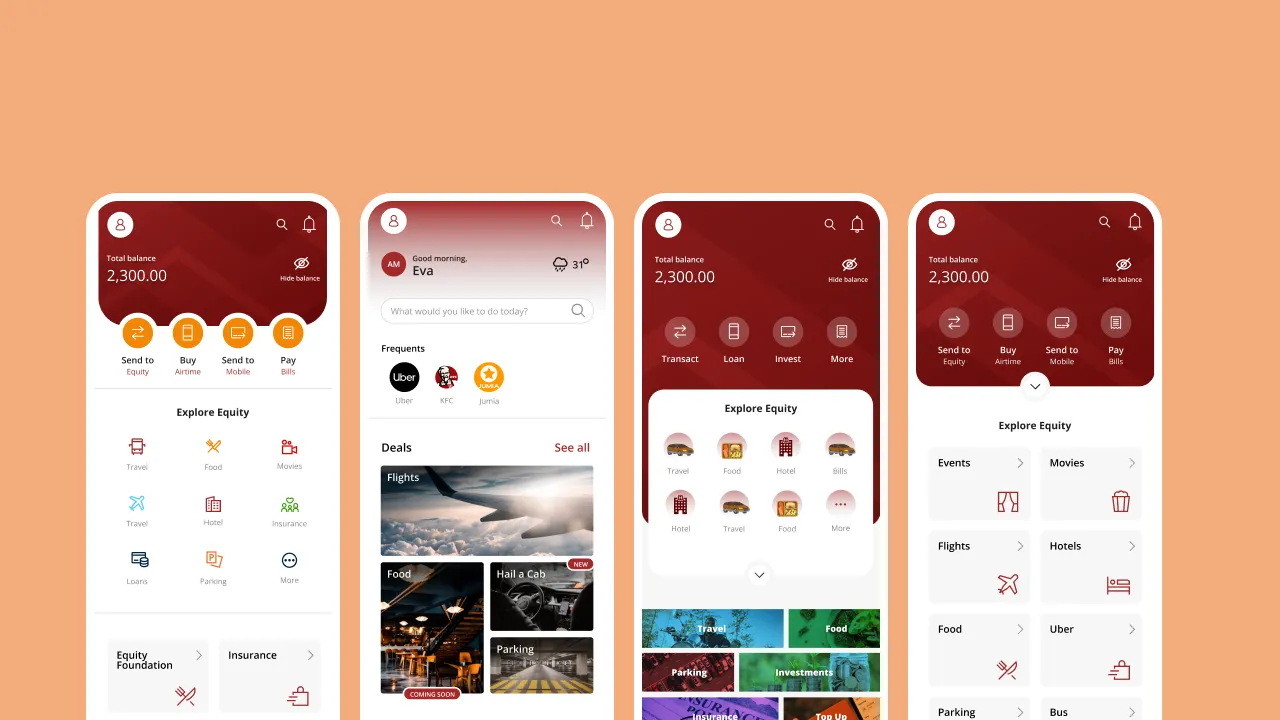
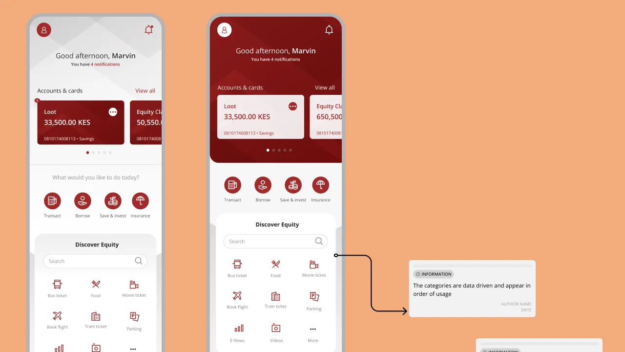
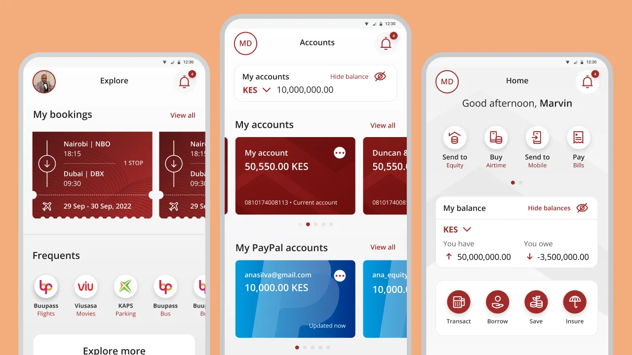
Home screen as the bridge The home screen became the place where both worlds had to make sense simultaneously. Core banking actions, balance, send, pay, needed to be immediate and prominent. Lifestyle and mini-app discovery needed to be present but not competing for the same attention.
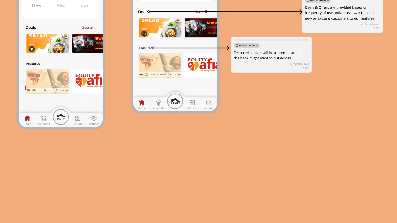
I added a carousel banner component on the home screen to surface deals and active promotions from mini-apps. This solved a real discovery problem, users wouldn't find mini-app offers if they had to navigate into the Explore tab to encounter them. The banner gave lifestyle features visibility without taking over the primary banking experience.
I also considered a collapsible component to display all mini-apps from the home screen directly, but cognitive overload testing made that a non-starter. Instead, I split the entry points: a lightweight surface on the home screen for discovery, and the dedicated Explore tab for depth. Personalisation logic would eventually determine which mini-apps were surfaced to which users, that groundwork was laid even if the full system hadn't shipped yet.
Security wasn't just an engineering concern. With a background in cybersecurity, I was directly involved in how security surfaced in the UI, not just flagging requirements for engineering to handle. Session token expiry, consent flow consolidation (merging multiple consent boxes into single, contextual asks to reduce unnecessary taps), API error state handling, and failed loading states were all areas where I shaped the design. The goal was to make security legible to users without making it feel punishing. A session timeout shouldn't feel like an error. A failed transaction should tell you exactly what happened and what to do next.
icons
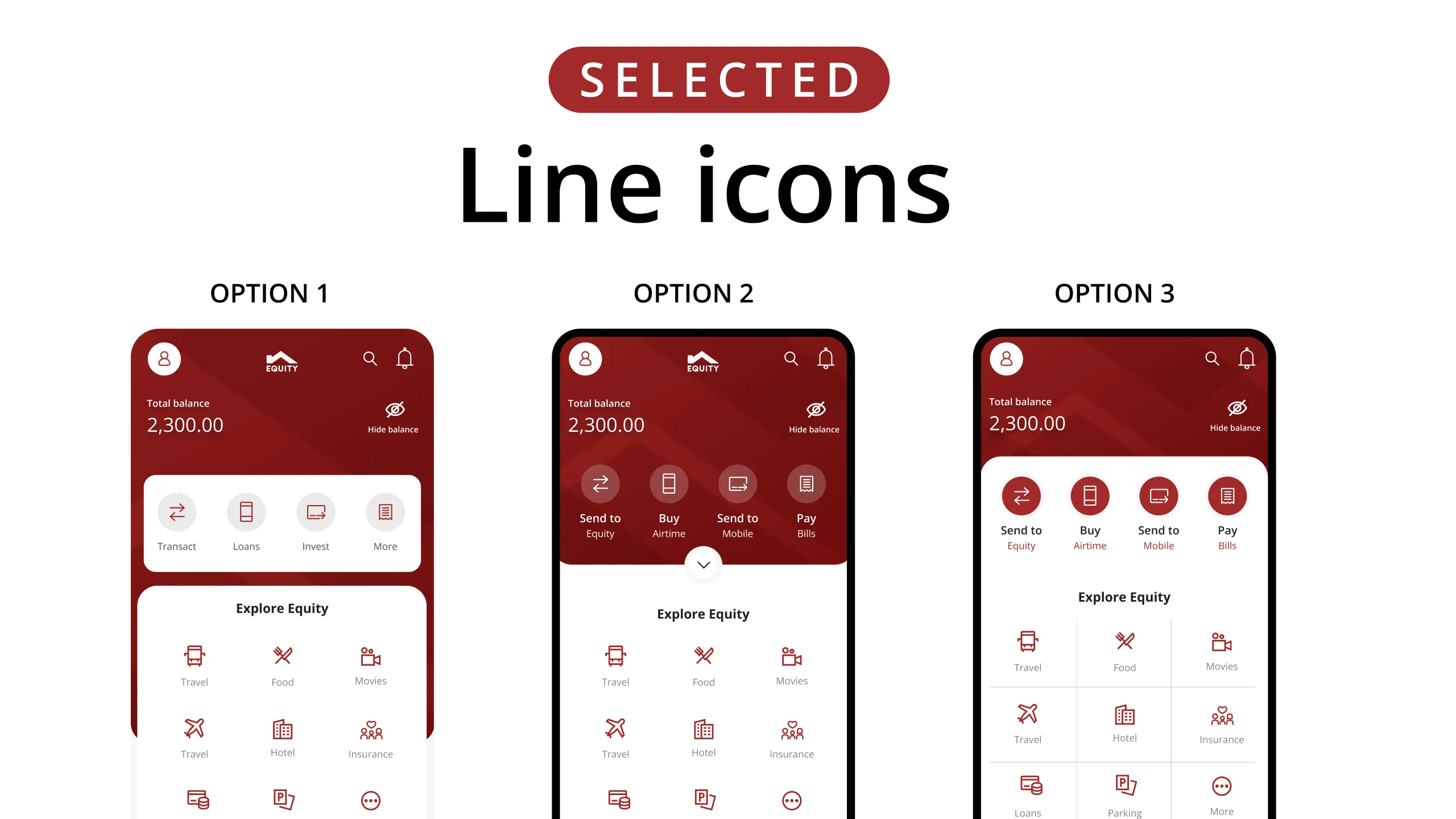
Rather than scrambling to fill the gap, I used the time to build a robust design system, component library, token structure, iconography guidelines, motion principles. When sprint velocity increased, the system absorbed the pace without breaking.
Engineering Collaboration
What can ship now vs what we build toward
Weekly syncs with engineering weren't a formality, they were where real product decisions got made.
Understanding build feasibility shaped the design roadmap in concrete ways. I needed to know which components could ship quickly versus which required infrastructure that was still being built. That affected sequencing, what we put in Phase 1, and how we communicated timelines to stakeholders.
Partner integrations surfaced the hardest technical constraints. Several planned mini-apps required APIs to be built from scratch. What looked like standard integration work turned into months of back-end development, compressing the design timeline significantly. Rather than filling that gap with more screens, I used it to extend the design system and build the components that would be needed when velocity increased.
I also regularly challenged flows in the PRDs, not to be difficult, but because some edge cases weren't accounted for that had real user impact. Drop-off experiences mid-active-mini-app. Timeout and progress notifications when a mini-app was running with the phone locked. Consent box consolidation. These conversations required rescoping, and they were worth having.
The honest version
Why the Super App Didn't Ship (Yet)
The original vision, lifestyle mini-apps, third-party integrations, the full Explore ecosystem, hasn't launched. Here's what actually happened.
Several of the partners we had onboarded ran into legal issues. Equity, a bank whose users were already questioning whether it was safe for their money, couldn't afford to be associated with partners under legal scrutiny. The decision was made to pause the super app features.
As those issues were being resolved, we also confronted the partner readiness problem more clearly: APIs that weren't built, legal agreements that weren't finalised, technical integrations that were more complex than originally scoped. Phase 1 inclusion should have been gated on technical and legal readiness from the start. It wasn't.
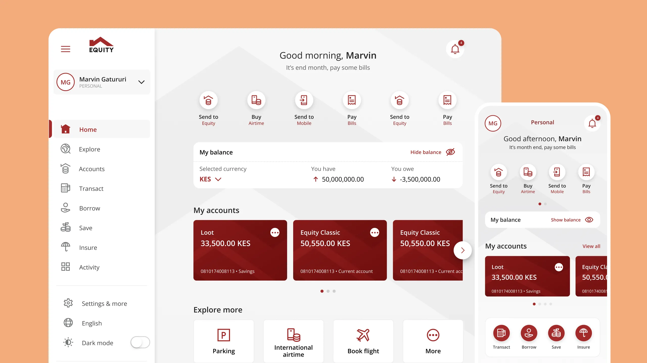
So I designed V1, the version that would actually ship. Stripping out the lifestyle layer, pulling the navigation back from five items to three, removing the mini-app entry points, and returning the focus to what users trusted Equity for: core financial services, done reliably and well.
That's what launched in 2023.
Outcome
What shipped, what improved, what we learned
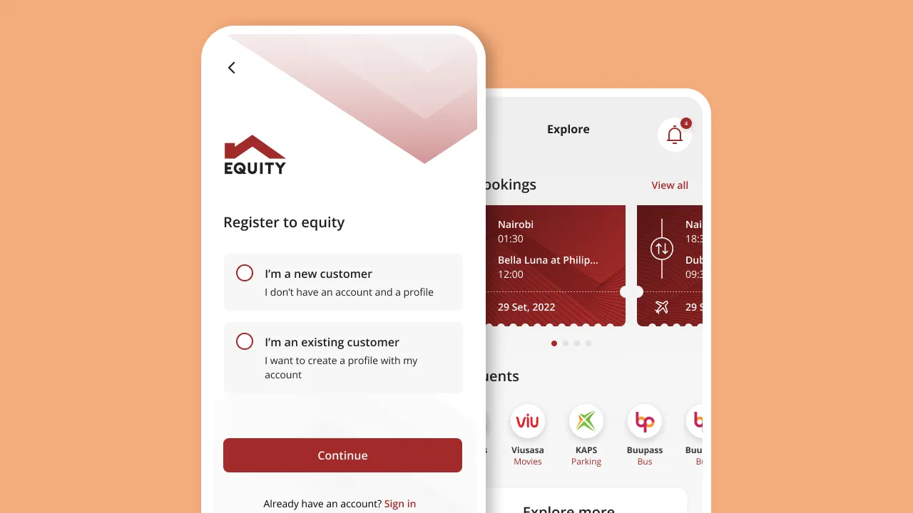
The redesigned Equity Mobile launched in 2023, a significantly improved core banking app with a scalable architecture underneath, ready to activate when the super app vision resumes.
34% improvement in task completion for core banking flows versus the legacy app.
20% improvement in onboarding completion, users getting through registration and first login successfully, a flow that had been a significant source of drop-off and support tickets.
Login success rate improved following the rearchitected authentication flows and OTP handling.
Adoption was slower than projected, users were familiar with the old app, and the transition required more hand-holding than the launch supported. That's a lesson.
The super app infrastructure, the design system extensions, the IA, the component patterns, is all there, waiting. That work wasn't wasted. It's the foundation for what comes next.
Retrospective
What I'd do differently
- Keep the old app running in parallel for 60–90 days post-launch. Let users migrate on their own timeline. Forcing the switch before they were ready created avoidable friction and fuelled the adoption dip.
- Invest in onboarding before launch, not after. Most of the confusion was navigational, users didn't know where things had moved. A short, well-designed how-to flow would have absorbed a significant amount of that friction before it became a support issue or a negative review.
- Gate phase inclusion on partner readiness. Legal and technical readiness should be a hard prerequisite for being included in a launch phase, not something you discover mid-build. The pain of a delayed partner is far less than the pain of a broken one.
- Build explicit scope freeze points into the project structure. Without defined checkpoints, scope creep compounds quietly. Business units seeing momentum want in. Without documented criteria for what belongs in Phase 1, every request feels equally valid, and timelines collapse.
- Push for a soft launch with a beta cohort before full rollout. The OTP failures would almost certainly have been caught and resolved before they reached millions of users.
- Advocate harder for launch marketing investment. A redesigned app needs to be introduced. It doesn't explain itself. Users who haven't heard about it will open the app, see something unfamiliar, and assume something is wrong.

Retrospective/Learnings
What This Project Taught Me
The most important design work on this project wasn't on a screen.
It was in a stakeholder session, making the case for Option B with data. It was in a scope discussion, holding a line that needed to be held. It was in an engineering sync, understanding what was actually buildable in the time we had. It was in the decision to ship V1 and do it right, rather than ship an incomplete super app and do it badly.
Super apps aren't primarily a design problem. They're an organisational problem that design has to navigate, across business units, engineering timelines, partner dependencies, and market readiness. The pixels matter. But so does the judgment around them.
That's what I brought to this project. That's what I bring to every one.